In collaborating with Wiss, a New Jersey-based accounting firm, the primary goal was to give the firm a sharper identity and a digital presence through a website redesign. Read the full case study below:
The Problem:
WISS wanted to elevate their overall branding while making it easier for potential clients to browse the wide variety of services they offered and while minimizing the number of clicks it took to do so.
WISS wanted to elevate their overall branding while making it easier for potential clients to browse the wide variety of services they offered and while minimizing the number of clicks it took to do so.
The Process:
We started by auditing the site to determine what was working and what wasn’t. This included everything from the overall branding (like colors and typefaces) to the browsing ability of their many services pages. From there, we created wireframes to determine how all of the information could be broken down to something more digestible, presented new typeface options to enhance style and legibility, and selected a new color palette. This was done in collaboration with a copywriter and the C-Suite-level stakeholders at WISS to make it easier for potential clients to browse the wide variety of services they offered and minimize the number of clicks. Once the information hierarchy was determined, we moved on to high-fidelity designs using the updated branding guidelines.
We started by auditing the site to determine what was working and what wasn’t. This included everything from the overall branding (like colors and typefaces) to the browsing ability of their many services pages. From there, we created wireframes to determine how all of the information could be broken down to something more digestible, presented new typeface options to enhance style and legibility, and selected a new color palette. This was done in collaboration with a copywriter and the C-Suite-level stakeholders at WISS to make it easier for potential clients to browse the wide variety of services they offered and minimize the number of clicks. Once the information hierarchy was determined, we moved on to high-fidelity designs using the updated branding guidelines.
Key Decisions:
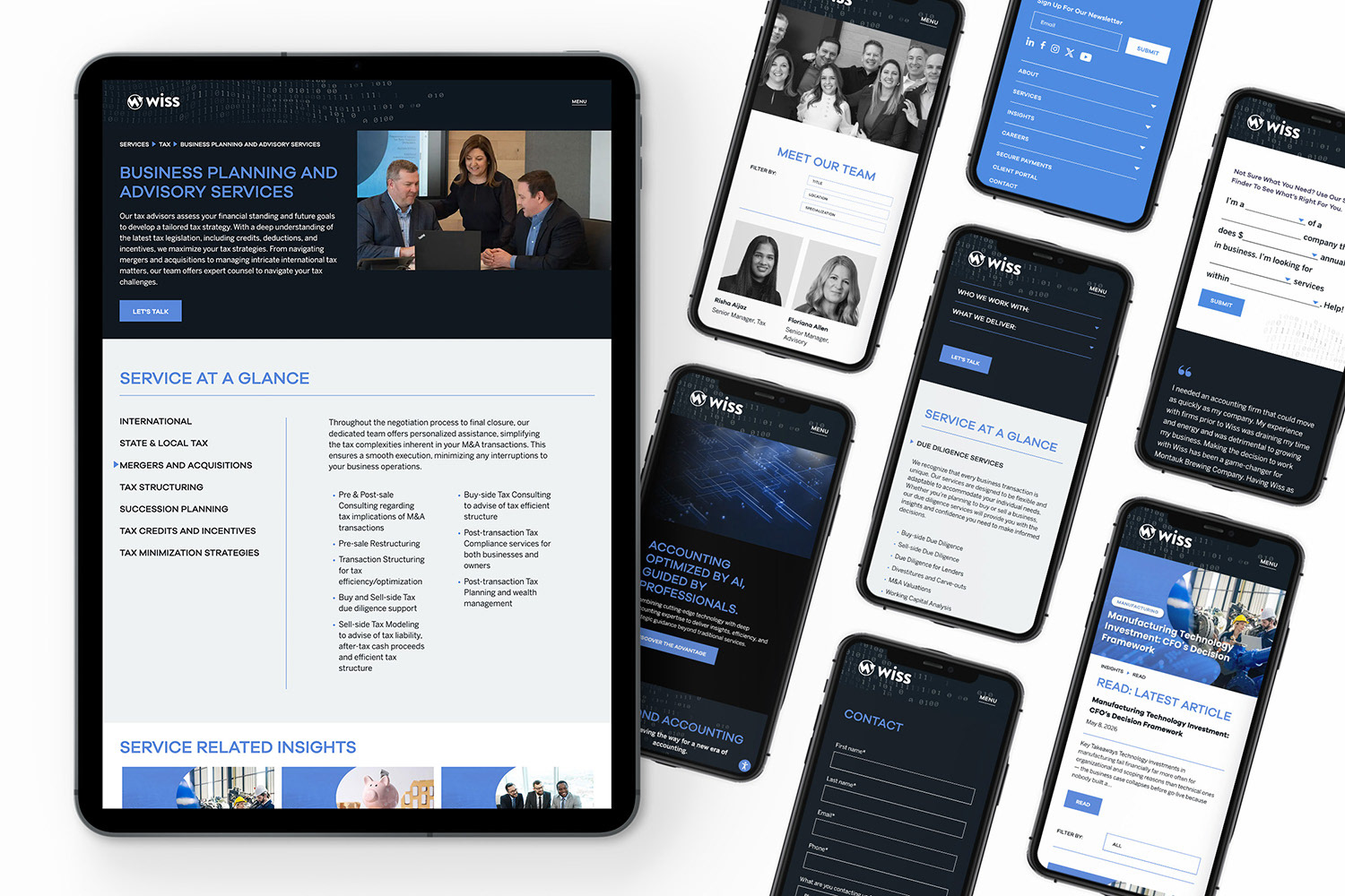
1. Condensed all of the information in the “Services” breakdown to give the customer a glance at all the services without having to click through so many pages.
2. Created a fill-in-the-blank-style quiz to help a user quickly determine which type of Service would be most beneficial to them. This would either point them to a services page for them to learn more or a contact button which would automatically fill in fields on the inquiry form based on the answers to their quiz.
3. Updated the typefaces to a modern sans-serif to improve legibility and information hierarchy. The color palette was also updated to use darker colors, tech-inspired light greys, and the brand’s signature cobalt blue to feel sleek and sophisticated.
1. Condensed all of the information in the “Services” breakdown to give the customer a glance at all the services without having to click through so many pages.
2. Created a fill-in-the-blank-style quiz to help a user quickly determine which type of Service would be most beneficial to them. This would either point them to a services page for them to learn more or a contact button which would automatically fill in fields on the inquiry form based on the answers to their quiz.
3. Updated the typefaces to a modern sans-serif to improve legibility and information hierarchy. The color palette was also updated to use darker colors, tech-inspired light greys, and the brand’s signature cobalt blue to feel sleek and sophisticated.
The Outcome:
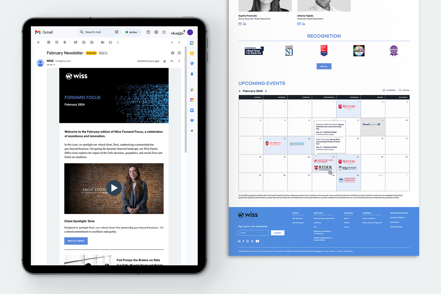
At the end of the redesign, WISS’ website felt cohesive, elevating the brand from a standard-looking accounting firm to a modern and innovative company highlighting their top-notch skills/services and dedication to their clients. The update led to clients and potential clients better understanding the breakdown of the firm’s services and more service contact inquiries*.
At the end of the redesign, WISS’ website felt cohesive, elevating the brand from a standard-looking accounting firm to a modern and innovative company highlighting their top-notch skills/services and dedication to their clients. The update led to clients and potential clients better understanding the breakdown of the firm’s services and more service contact inquiries*.
* Specific numbers were not provided, unfortunately. We only received feedback that the number of inquiries had gone up.
Designed under the direction of: Jonina Skaggs, Art Director
Bradley Skaggs, Creative Director
Website